Monday, January 31, 2011

#36 Faith


I chose this photo of my church, Seeds of Faith, as my visual description of the word "Faith". I realize that a building does not define a person's faith, but much of my strength comes from the people in this building.

I edited this photo on iPhoto, adding some clarity and contrast and finishing with the "vignette' setting under "effects".

Friday, January 28, 2011

#21 TIME


I chose this photo of pansies to represent "Time".....not in the ordinary sense of clocks or watches, but simply a time in my life....a time when mom was here, a time when we would sit in her back yard, near her planter of pansies, often the time around Sunday afternoon, enjoying coffee, laughter and "time" together.

I applied clarity, saturation and contrast to the photo, actually taken on the Drake University Campus. I LOVE the water droplets on the left side of the photo and the intense contrast between flowers and background. Take Time to Smell the Flowers!!

Thursday, January 27, 2011

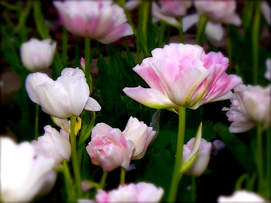
#14 Spring


This photo was taken at Orange City,Ia at the Tulip Festival. I chose this photo to describe "Spring". Tulips are so fleeting, staying only for a short time at the arrival of "Spring".

This photo was simply edited on iPhoto, enhancing color and contrast under button, "adjust", and adding the "edge blur" under "effects".

Wednesday, January 26, 2011

#35 WORK


This photo reminds me of work, all the hard work and dedication and sweating out in the blazing sunlight it took and continues to take to make a good team.

I did all edits in Photoscape, superimposing one picture on top of another and making it as transparent as possible so it would not mask the photo beneath. I raised the saturation and contrast and added the dark edges in a task called "vignette". The lettering was also done on Photoscape.

Monday, January 24, 2011

#12 Spirit


This was taken during a recent baptism and says "Spirit" to me!
Spirit of the living God, One Body, One Lord, One Hope, One Faith, One Spirit....


I cropped and enhanced contrast and color on Photoscape. That's it!!!!

Saturday, January 22, 2011

#16 UP


I took this photo from the top of a look out tower in a rest stop on an Iowa Interstate. I well remember the feeling of being UP!!! I was actually up too high for my liking!

This photo was cropped and enlarged and a little added contrast and clarity and that is it! I think the tilt of the photo helps add to the feeling of being off the ground and very high UP!

Friday, January 21, 2011

#38 Movement


This photo was taken earlier this school year when I gave the assignment "Scenery". I chose this photo to describe the word, "movement". I LOVE the crisp colors in this photo and I LOVE how the water looks like it is rushing over the rocks.

I edited this photo in iPhoto, upping the saturation and contrast and using a tool in the category called "Adjust" where I moved the "sharpness" bar to the right increasing the clarity of the photo.